Model Selection & Regularization
Regularization
Let's reexamine linear regression.
\[ Y = \beta_0 + \beta_1 X_1 + \beta_2 X_2 + \dots + \beta_p X_p + \epsilon \]
Linear regression has many advantages such as simplicity, tractability and explainability so let's look at some techniques for getting more out of it.
The fitting procedure we used was least squares, namely we looked for the \(\beta_j, 0 \leq j \leq p\) which minimized the residual sum of squares (RSS):
\[ RSS = \sum_{i=1}^n ( y_i - \hat{y_i})^2 \]
Prediction accuracy
In the cases we have looked had so far we have had \(n \gg p\), i.e. the number of data points is much greater than the number of dimensions. In these cases, when the true relationship is nearly linear then the least squares estimate will have low bias and low variance.
However if \(n\) is not much larger than \(p\) then it can overfit and predict poorly on test data.
If \(p > n\) then there can be infinitely many minima and the \(\beta_j\) can get very large. This can lead to very poor performance on test data. To try to keep this in check we will constrain or limit the sizes of the \(\beta_j\).
(This collection of Optimization Test Problems contains example functions which have many local minima. There is also a Wikipedia page on Test functions for optimization. Gradient descent is a standard method for finding minima.)
Model interpretability
Are all of our variables relevant to the prediction we wish to make? Including irrelevant variables leads to unnecessary complexity of our models. The removal of such irrelevant variables is called feature selection or variable selection.
Subset selection
What is the best subset of features? If we have \(p\) features then we have \(p\) subsets containing one feature, \(\binom{p}{2}\) containing two, and so forth.
In total we have \(2^p\) subsets of features.
Best subset selection
- Let \(\mathcal{M}_0\) be the model containing no features. It predicts the sample mean for each observation.
- For \(k = 1,2, \dots, p\)
- Fit all \(\binom{p}{k}\) models that contain \(k\) features.
- Pick the best of these by RSS or equivalently \(R^2\) and call it \(\mathcal{M}_{k+1}\).
- Select the best among \(\mathcal{M}_0, \mathcal{M}_1, \dots, \mathcal{M}_p\) either by using a validation set or by cross-validation.
For step 3, we need to be careful to use a validation set, since the performance on the training set will improve monotonically.
Here are the results for the Credit data set. There is little improvement
beyond three features.
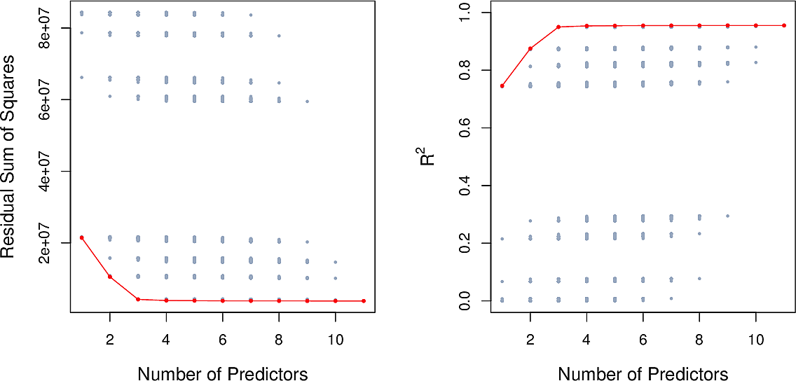
Best subset selection is straightforward but unsuitable when we have many features. For \(p=10\) there are already over 1000 models to check.
Forward stepwise selection
- Let \(\mathcal{M}_0\) be the model containing no features. It predicts the sample mean for each observation.
- For \(k = 1,2, \dots, p\)
- Fit all \(p - k\) models that augment \(\mathcal{M}_k\) with a single feature.
- Pick the best of these by RSS or equivalently \(R^2\) and call it \(\mathcal{M}_{k+1}\).
- Select the best among \(\mathcal{M}_0, \mathcal{M}_1, \dots, \mathcal{M}_p\) either by using a validation set or by cross-validation.
This is a greedy approach. It reduces the total number of models to fit from \(2^p\) to around \(p^2\). But we are not guaranteed to find the best subset of features.
Backward stepwise selection
Here we start will all features and work backwards.
- Let \(\mathcal{M}_p\) be the model containing all features.
- For \(k = p, p-1, \dots, 1\)
- Fit all \(k\) models that contain all but one of the predictors in \(\mathcal{M}_k\).
- Pick the best of these by RSS or equivalently \(R^2\) and call it \(\mathcal{M}_{k-1}\).
- Select the best among \(\mathcal{M}_0, \mathcal{M}_1, \dots, \mathcal{M}_p\) either by using a validation set or by cross-validation.
Hybrid approaches
Other strategies mixing forward and backward steps can be considered.
Optimal model selection
For each of the selection methods, in Step 3 we need to select the best of a set of models which have different numbers of features. Whether we use RSS or \(R^2\), the training error will not be suitable.
Here are four information-theoretic criteria which we can use. Each one adjusts the training error for model size allowing us to compare models of different sizes.
They all have rigorous theoretical justifications but these are beyond the scope of this course.
All of these measures are simple to use and compute.
Here are three of the measures for the Credit data set.
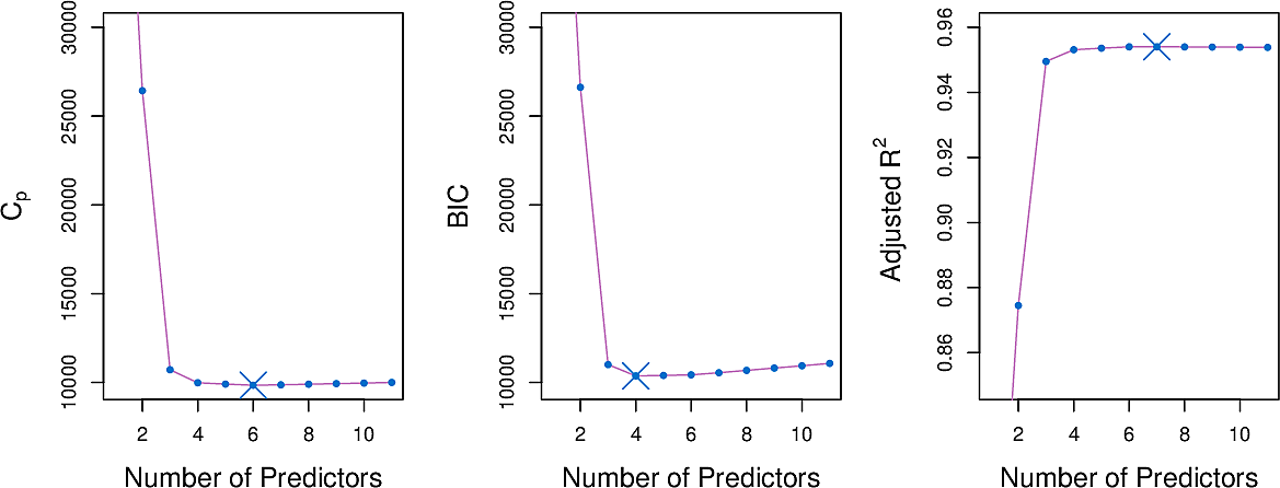
\(C_p\) statistic
The \(C_p\) statistic adds a penalty to the training RSS in order to adjust for the fact that the training error tends to underestimate the test error.
\[ C_p = {1 \over n} (RSS + 2 d \hat\sigma^2) \]
where \(\hat\sigma^2\) is an estimate of the variance of the error \(ϵ\) associated with each response measurement.
Akaike information criterion
The Akaike information criterion is motivated differently but differs from the \(C_p\) statistic only by a constant.
Bayes information criterion
\[ C_p = {1 \over n} (RSS + \log(n) d \hat\sigma^2) \]
Adjusted \(R^2\)
\[ \text{Adjusted} \;\; R^2 = 1 - { RSS(n - d - 1) \over TSS (n-1)} \]
(An example of finding the most parsimonious model using adjusted \(R^2\).)
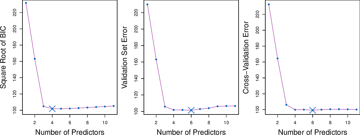
Validation and cross-validation
Rather than use the information-theoretic criteria, we can also use a hold-out set to perform validation or indeed perform cross-validation on our entire set.
Here are some results for the Credit data set.
Shrinkage
Ridge regression
We adapt our fitting procedure. Instead of minimising the RSS
\[ \sum_{i=1}^n ( y_i - \hat{y_i})^2 = \sum_{i=1}^n \left( y_i - \beta_0 - \sum_{j=1}^p \beta_j x_{ij} \right)^2 \]
we add an extra term
\[ \sum_{i=1}^n \left( y_i - \beta_0 - \sum_{j=1}^p \beta_j x_{ij} \right)^2 + \lambda \sum_{j=1}^p \beta_j^2 \]
The extra term penalises large values of the \(\beta_j\). Note that the intercept term \(\beta_0\) is not included since it should remain centred on the mean of the response.
Here \(\lambda \geq 0\) is a hyperparameter, to be determined later by tuning.
- When \(\lambda \approx 0\) the term has little effect resulting in ordinary linear regression.
- When \(\lambda\) is large it will force all \(\beta_j\) to zero.
Let's have a look at the Credit Card dataset. Note there are \(400\) data points in the dataset.
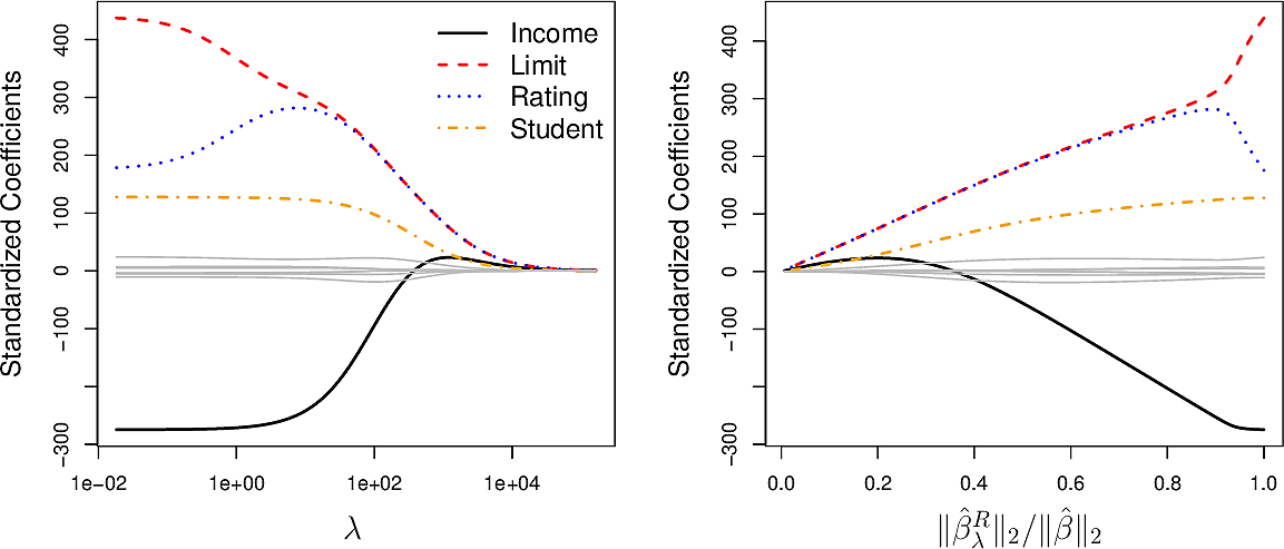
The plot on the left shows how varying \(\lambda\) influences the values of the coefficients of the 10 variables.
- High values of \(\lambda\) drive all of the coefficients to zero and gives us a null model.
- Low values of \(\lambda\) give us the ordinary linear regression coefficients.
- Values in between result is small coefficients for most variable but the
coefficients of the variables
income, limit, rating, studentremain larger. This can be an indication that these four variables are more important than the others.
The plot on the right shows the coefficients plotted against \(\big\| \hat{\beta}^R_\lambda \big\|_2 / \big\| \hat{\beta}_\lambda \big\|_2\), the ratio of the ridge \(\beta\) vector to the ordinary \(\beta\) vector, where \[ \big\| \beta_\lambda \big\|_2 = \sqrt{ \sum_{j=1}^p \beta_j^2} \] is the \(\mathscr{l}_2\) norm.
For ordinary linear regression, the coefficients are scale equivariant; scaling up a variable will lead to a commensurate scale down of its coefficient, keeping \(X_j\hat{\beta}_j\) the same.
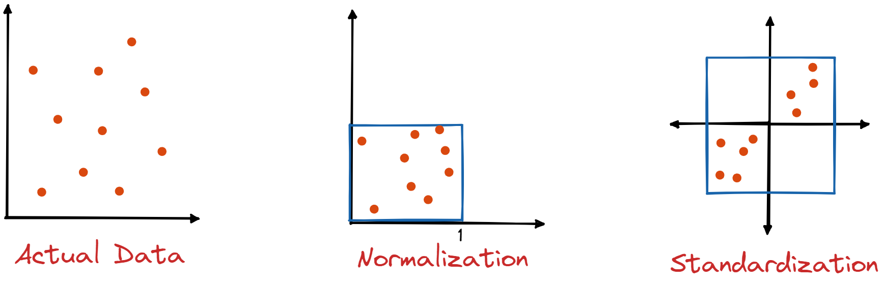
This does not hold for ridge regression so it is important to note that, before carrying out ridge regression, all predictors should be standardized.
Bias and variance
To examine bias and variance we take a synthetic data set with \(p = 45\) predictors and \(n = 50\) observations to illustrate the effect of ridge when we do not have \(n \gg p\).

These plots show how varying \(\lambda\) influences the bias and variance of ridge regression.
- The dashed line is the minimum possible MSE
- The red line is the MSE on test data
- The green line is variance
- The black line is squared bias
Notice how, for small \(\lambda\), the model has almost zero bias but considerable variance. This is an indication that the true relationship is roughly linear.
As we increase \(\lambda\), the bias remains low but the variance decreases significantly until we get to a point where \(\lambda\) becomes so high that it constrains the coefficients to the extent that the bias begins to rise until finally we reach the null model.
The MSE on test data is closely related to the sum of the variance and squared bias.
The minimum MSE on test data is for a value of \(\lambda\) around 30.
Ridge regression can be effective where the true relationship is roughly linear and the number of data points \(n\) is not significantly larger that the number of variables \(p\).
Lasso regression
We saw in the case of the Credit Card dataset how ridge regression forced the
coefficients of some of the variables to lower values. What if we could force
some of those coefficients to zero? The could act as a form of variable
selection, filtering out predictors which have a negligible influence on the
response.
To this end we make a small change to our fitting procedure.
\[ \sum_{i=1}^n \left( y_i - \beta_0 - \sum_{j=1}^p \beta_j x_{ij} \right)^2 + \lambda \sum_{j=1}^p \left| \beta_j \right| \]
We have replaced the square of the \(\beta_j\) in the extra term from ridge regression by its absolute value. This corresponds to and \(\mathscr{l}_1\) penalty instead of an \(\mathscr{l}_2\) penalty. We call this lasso regression.
The effect of this seemingly small change is that the coefficients of some variable can now be forced to zero. In other words, these variables do not appear in the resulting model; lasso performs variable selection and results in sparse models.
Let's have a look at varying \(\lambda\) in lasso regression for the Credit Card data.

We see that the effect of lasso is more striking that that of ridge. As \(\lambda\) increases, all of the variables are ultimately driven to zero, but some more quickly than others.
The plot on the right shows that lasso first selects a model containing only the rating variable, then adds limit and student and then income. In this way we could select \(\lambda\) in order to result in a model with 1, 3 or 4 variables. This could be helpful for model interpretability.
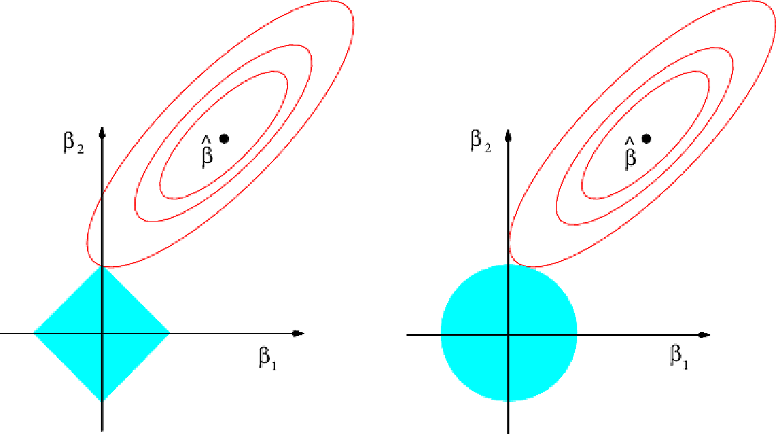
To understand why lasso is more likely to drive coefficients to zero, let's look at the plot above. Here the minimal RSS solution is marked as \(\hat{\beta}\). The contour lines around it correspond to constant values of RSS.
The blue diamond and circle represent the lasso and ridge constraints.
Combining the two in the fitting procedure, the optimal point will be where the first contour touches the diamond or circle. For the diamond, because it is pointed, that point is more likely to be on an axis; exactly the point where a coefficient is zero. On the diagram it occurs where \(\beta_1 = 0\)
Comparing ridge and lasso
We have seen that lasso has an advantage over ridge when it comes to variable selection and model interpretability. But for this do we have to sacrifice prediction accuracy?
Let's look a variance, squared bias and test MSE for lasso on the same synthetic dataset as before.

The results are qualitatively similar to those of ridge. On the right plot, the dotted lines are for ridge, here plotted against their \(R^2\) on training data. It shows almost identical biases but slightly better variance than lasso.
But this is not showing lasso to the best of its advantage. It is showing the curves for all \(45\) predictors, while lasso has driven the coefficients for most of these to zero. What if we select \(\lambda\) to drive all but 2 of the coefficients to zero.

Now we see that lasso tends to outperform ridge.
In general neither lasso nor ridge will universally dominate the other. Lasso will tend to be better where it can drive some coefficients to zero. Ridge will be preferred where that is not the case. As this will not generally be known in advance, techniques such as cross-validation will need to be applied. There are efficient algorithms for both ridge and lasso.
A special case
To help our intuition understand how ridge and lasso differ, let's consider a special case with three simplifying assumptions.
- \(n =p\)
- \(X\) is a unit diagonal matrix (ones on the diagonal, zeros elsewhere)
- There is no intercept, i.e. \(\beta_0 = 0\)
Now for least squares we need to minimise \[ \sum_{j=1}^p (y_j - \beta_j)^2 \] so the solution is \[ \hat{\beta}_j = y_j \]
Ridge minimises \[ \sum_{j=1}^p (y_j - \beta_j)^2 + \lambda \sum_{j=1}^p \beta_j^2 \]
Lasso minimises \[ \sum_{j=1}^p (y_j - \beta_j)^2 + \lambda \sum_{j=1}^p \left| \beta_j \right| \]
We can show that these result in values for \(\beta\) of \[ \hat{\beta}^R_j = y_j / (1 + \lambda) \] and
\begin{equation} \hat{\beta}^L_j = \begin{cases} y_j - \lambda/2 & \text{if} \; y_j > \lambda/2 \\ y_j + \lambda/2 & \text{if} \; y_j < - \lambda/2 \\ 0 & \text{if} \; \left| y_j \right| \leq \lambda/2 \end{cases} \end{equation}To see what this means let's plot them.
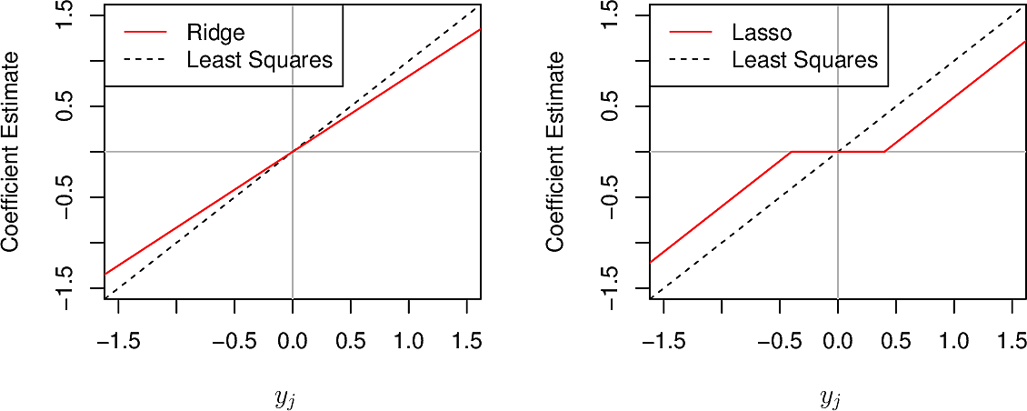
We see that where ridge gradually reduces coefficients to zero in all cases, lasso does so in most cases but forces a coefficient to zero when \(\left| y_j \right| \leq \lambda/2\)
Dimension reduction
Principal Component Analysis
Problems of both supervised and unsupervised learning become difficult when the dimensionality of the data is high. Some techniques seek to reduce the number of dimensions without compromising the quality of the results. These techniques are known as dimensionality reduction methods. Let's first look at a case from supervised learning.
If we are working with a dataset with \(p\) dimensions \(X_1,\dots,X_p\) but we find that \(p\) is too large, we can seed to find a linear transformation of the predictor space into a space of smaller dimension \(Z_1, \dots, Z_m\) where $ m<p $.
Let's look at a couple of examples in lower numbers of dimensions.
Figure 1: A quite linear scatterplot
Although these points are in two dimensions, they are quite linearly distributed. We could represent each point as a single dimension by the position of its projection onto the red line.

Figure 2: Child height versus father and mother's height
These points are in three dimensions but we can project the points onto the (two-dimensional) plane shown and neglect the third dimension (their distance from the plane).
The dimensions along which the data vary most are called the Principal Components of the data.
Let us look at the Advertising data and consider only two of the features,
pop, the city populations in 1000s and ad advertisement spending in $1000,
for 100 cities.
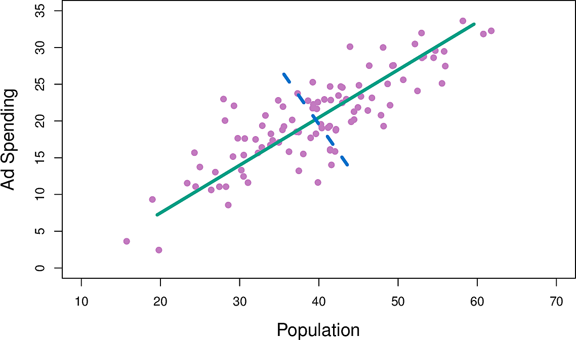
Figure 3: Population and advertisement spend
The green line is the principal component; the direction along which there is the greatest variation in the data in the sense that if we projected the data points onto that line they would have greater variance that onto any other line.
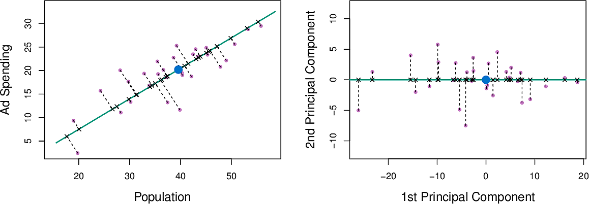
Figure 4: Principal component for population and advertisement spend
We can write this component as \[ Z_1 = 0.839 × (pop − \overline{pop}) + 0.544 × (ad − \overline{ad}) \]
The distance along the line is the principal component score. We can see that
both pop and ad have a strong relationship with \(Z_1\)
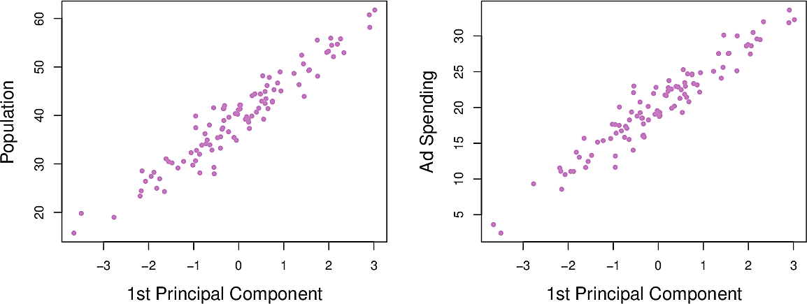
Figure 5: Population and advertisement as functions of \(Z_1\)
Now we can calculate the second principal component \(Z_2\). It is the linear combination of the variable which has the largest variance, subject to the constraint that it is uncorrelated with \(Z_1\). This means that it must be perpendicular or orthogonal to \(Z_1\). It turns out to be: \[ Z_2 = 0.544 × (pop − \overline{pop}) − 0.839 × (ad − \overline{ad}) \]
Note how the relationships between pop and ad and \(Z_2\) are weaker. This is
because most of the variance has already been captured in \(Z_1\). This suggests
that we can make adequate predictions using only \(Z_1\).
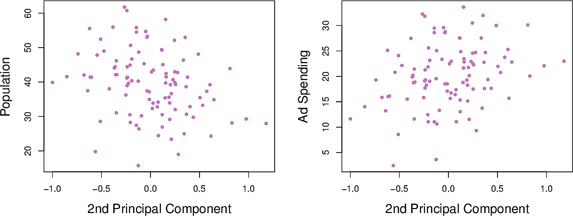
Figure 6: Population and advertisement as functions of \(Z_2\)
Now let's look at higher-dimensional data, namely the USArrests data set of violent crime rates by US state in 1973. It has four columns. All arrest rates are per 100,000 capita.
Murder: Murder arrestsAssault: Assault arrestsUrbanPop: Percent of population living in urban areasRape: Rape arrests
from statsmodels.datasets import get_rdataset

USArrests = get_rdataset("USArrests").data

USArrests.describe()
         Murder     Assault   UrbanPop       Rape
count  50.00000   50.000000  50.000000  50.000000
mean    7.78800  170.760000  65.540000  21.232000
std     4.35551   83.337661  14.474763   9.366385
min     0.80000   45.000000  32.000000   7.300000
25%     4.07500  109.000000  54.500000  15.075000
50%     7.25000  159.000000  66.000000  20.100000
75%    11.25000  249.000000  77.750000  26.175000
max    17.40000  337.000000  91.000000  46.000000
First we standardize each variable, that is we scale it so that it has mean 0 and standard deviation 1.
\begin{eqnarray*} z &= { x - \mu \over \sigma} \\ \mu &= \frac{1}{N} \sum_{i=1}^N x_i \\ \sigma &= \sqrt{\frac{1}{N} \sum_{i=1}^N (x_i - \mu)^2} \end{eqnarray*}Then we find its first two principal components and loading vectors.
| PC1 | PC2 | |
|---|---|---|
| Murder | 0.5358995 | −0.4181809 |
| Assault | 0.5831836 | −0.1879856 |
| UrbanPop | 0.2781909 | 0.8728062 |
| Rape | 0.5434321 | 0.1673186 |
We see that the first component gives approximately equal weight to all three
crimes but less to UrbanPop. This suggests that the three components
correspond to the general serious crimes rate. The second component then puts
most weight on UrbanPop suggesting that it corresponds to urbanization.
Furthermore the three crimes are pointing in roughly the same direction while
UrbanPop points in another direction. This suggests little relationship
between crime and urbanization.
Now we can plot each state in terms of these two principal components. This gives us an indication of which states have more or less crime and urbanization.
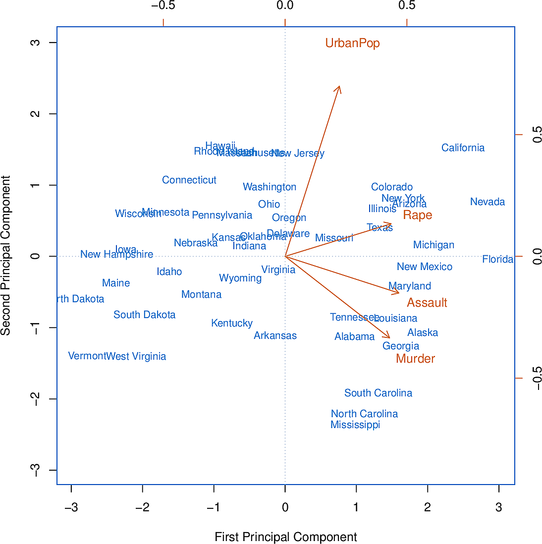
Figure 7: The first two principal components of USArrests
We can go further by asking the question, "How much of the variance in the data do the first \(m\) components explain?" The plot on the left is known as a scree plot. It can be used as a tool for deciding how many principal components to take by using the elbow method.
The total variance of the dataset is: \[ \sum_{j=1}^p Var(X_j) = \sum_{j=1}^p \frac{1}{n} \sum_{i=1}^n x_{ij}^2 \]
The variance explained by the \(m\)th principal component is \[ \frac{1}{n} \sum_{i=1}^n x_{im}^2 = \frac{1}{n} \sum_{i=1}^n \left( \sum_{j=1}^p \phi_{jm} x_{ij} \right)^2 \]
So the proportion of the variance explained (PVE) of the first \(m\) principal
components is the sum of the first \(m\) such terms. The PCA module of
scikit-learn provides an explained_variance_ method to calculate this for us.

Figure 8: Proportion of variance explained of USArrests
To illustrate how important it was to standardize the variables before calculating the principal components, consider their variances:
Murder |
18.97 |
Rape |
87.73 |
Assault |
6945.16 |
UrbanPop |
209.5 |
Since Assault has by far the largest variance, it will dominate the principal
component and give distorted results.
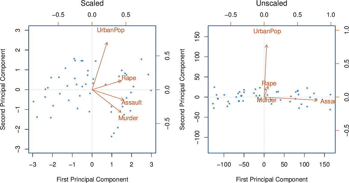
Figure 9: Principal components with and without standardization
Principal component analysis can be used as a preliminary step to applying methods for supervised learning.
Suppress some warnings
There are several warnings that we don't want to see so we suppress them.
from warnings import filterwarnings
from matplotlib import MatplotlibDeprecationWarning

filterwarnings(
    "ignore",
    category=UserWarning,
    message="The figure layout has changed to tight",
)
filterwarnings("ignore", category=MatplotlibDeprecationWarning)
np.set_printoptions(precision=4)
The iris dataset
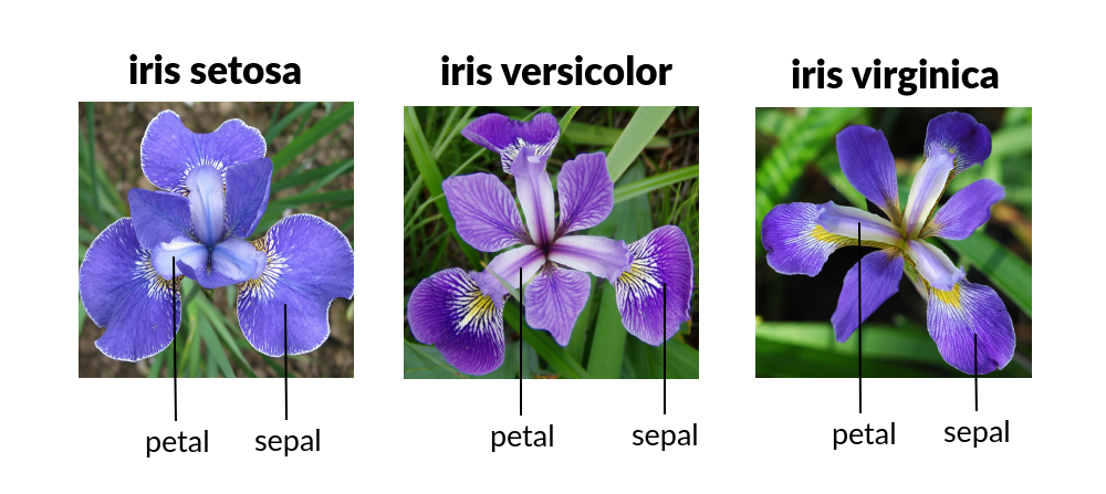
Figure 10: Iris species
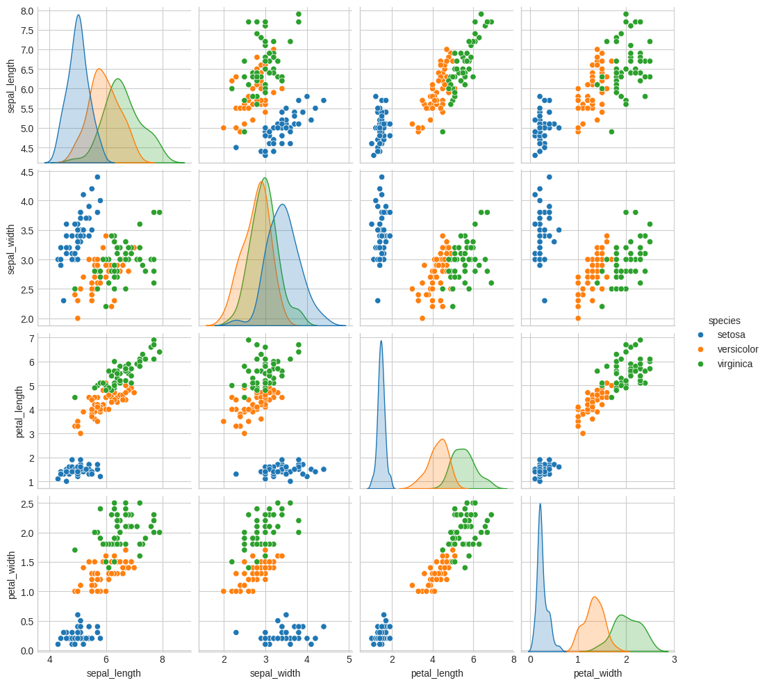
Let's load the iris dataset and look at the first few lines. The question is, can we predict the species from the lengths and widths of the sepals and petals of each individual iris.
import seaborn as sns

iris = sns.load_dataset("iris")
iris.head()
   sepal_length  sepal_width  petal_length  petal_width species
0           5.1          3.5           1.4          0.2  setosa
1           4.9          3.0           1.4          0.2  setosa
2           4.7          3.2           1.3          0.2  setosa
3           4.6          3.1           1.5          0.2  setosa
4           5.0          3.6           1.4          0.2  setosa
Let's now make a scatterplot, indicating the species by the hue of each point.
sns.pairplot(iris, hue="species")
plt.savefig("images/iris_pairplot.png")
X_iris = iris.drop("species", axis=1)
y_iris = iris["species"]
(X_iris.shape, y_iris.shape)
((150, 4), (150,))
We will do classification using Gaussian naïve Bayes. This is good baseline classifier because it is straightforward and has no hyperparameters. It assumes each cluster is a Gaussian aligned to one of the axes.
from sklearn.model_selection import train_test_split
from sklearn.naive_bayes import GaussianNB
from sklearn.metrics import accuracy_score

Xtrain, Xtest, ytrain, ytest = train_test_split(X_iris, y_iris, random_state=1)
model = GaussianNB()
model.fit(Xtrain, ytrain)
y_model = model.predict(Xtest)
f"{accuracy_score(ytest, y_model):0.4f}"
0.9737
We see that even with a simple classifier we get above 97% accuracy.
We would like to get a visualization of the clusters but there are 4 dimensions. The scatterplot gives us some impression of two dimensions at a time but how would we deal with it if we find ourselves with even higher dimensional data? One approach is Principal Component Analysis.
Principal Component Analysis
Let's first generate a random dataset.
import numpy as np
from numpy.random import rand, randn
import matplotlib.pyplot as plt

plt.clf()
X = np.dot(rand(2, 2), randn(2, 200)).T
plt.scatter(X[:, 0], X[:, 1])
plt.axis("equal")
plt.savefig("images/genset.png")
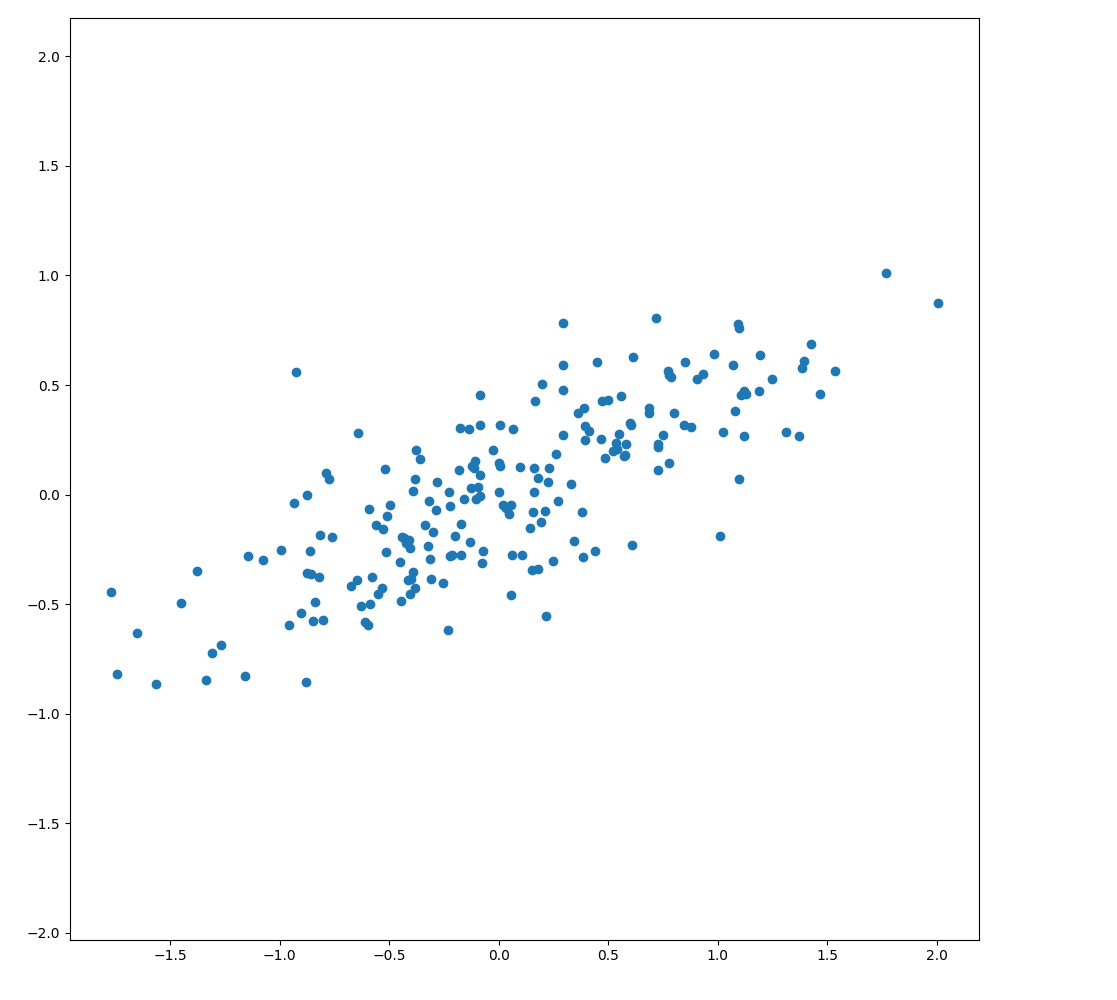
As expected, to the eye there is almost a linear relationship. Can we capture the important directions, or principal components of the data?
from sklearn.decomposition import PCA

pca = PCA(n_components=2)
pca.fit(X)
pca.components_
[[ 0.907   0.4212]
 [-0.4212  0.907 ]]
This gives us two vectors pointing along those components. We see that they can account for varying amounts of the variance.
pca.explained_variance_
[0.6296 0.0504]
Let's plot them as vectors on top of the data points.
def draw_vector(v0, v1, ax=None):
    ax = ax or plt.gca()
    arrowprops = dict(arrowstyle="->", linewidth=2, shrinkA=0, shrinkB=0)
    ax.annotate("", v1, v0, arrowprops=arrowprops)


plt.clf()
plt.scatter(X[:, 0], X[:, 1], alpha=0.2)
for length, vector in zip(pca.explained_variance_, pca.components_):
    v = vector * 3 * np.sqrt(length)
    draw_vector(pca.mean_, pca.mean_ + v)
plt.axis("equal")
plt.savefig("images/genset-vectors.png")
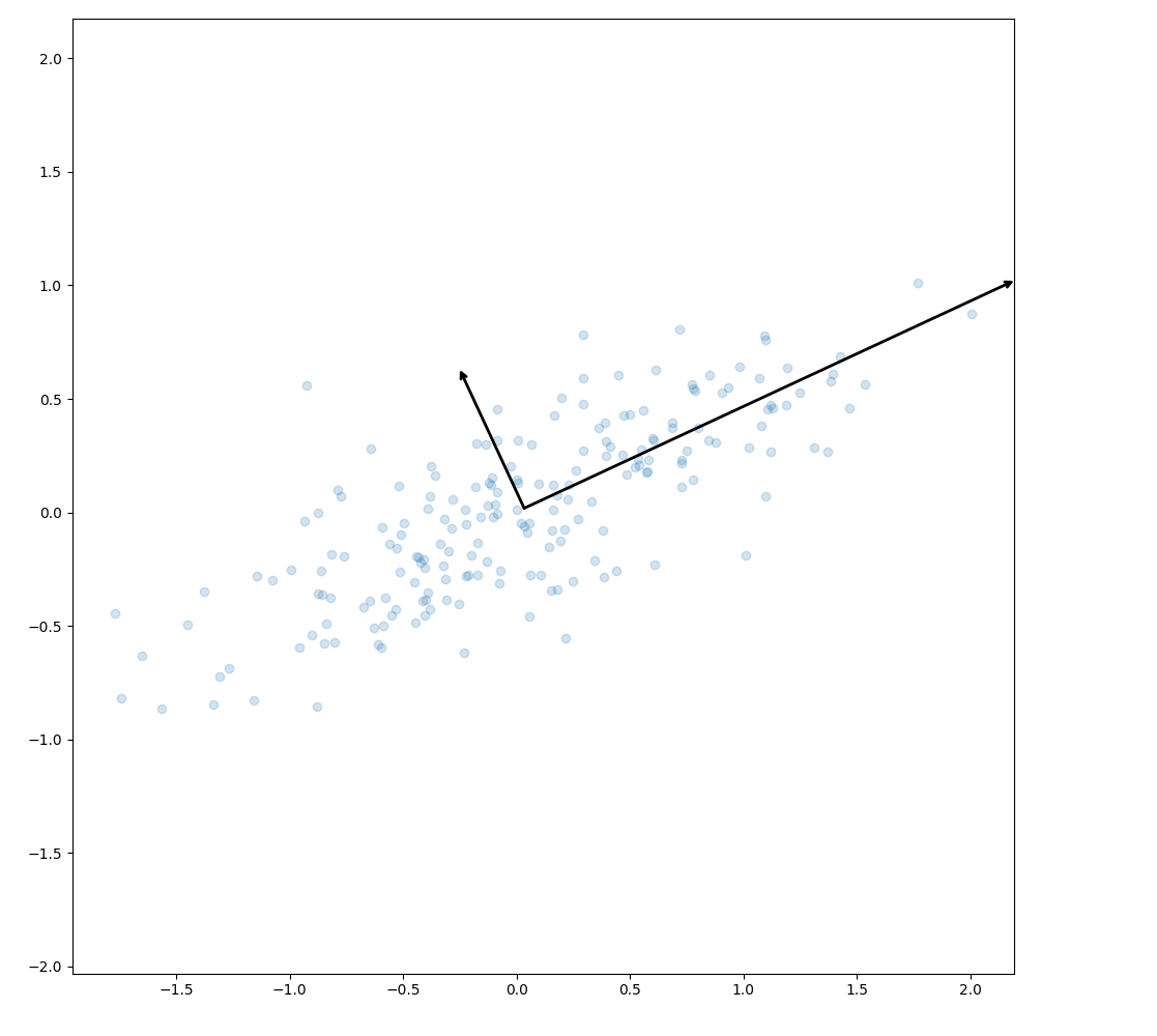
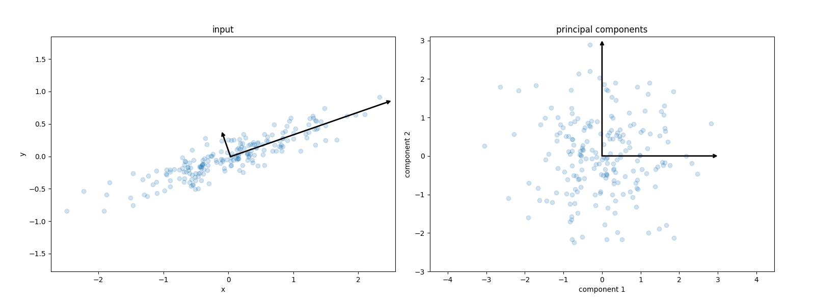
The vectors are the principal axes of the data. We can now perform an affine transformation to show how the data look when the principal axes are transformed to the xy-axes.
from sklearn.decomposition import PCA


def draw_vector(v0, v1, ax=None):
    ax = ax or plt.gca()
    arrowprops = dict(arrowstyle="->", linewidth=2, shrinkA=0, shrinkB=0)
    ax.annotate("", v1, v0, arrowprops=arrowprops)


rng = np.random.RandomState(1)
X = np.dot(rng.rand(2, 2), rng.randn(2, 200)).T
pca = PCA(n_components=2, whiten=True)
pca.fit(X)

plt.clf()
fig, ax = plt.subplots(1, 2, figsize=(16, 6))
fig.subplots_adjust(left=0.0625, right=0.95, wspace=0.1)

ax[0].scatter(X[:, 0], X[:, 1], alpha=0.2)
for length, vector in zip(pca.explained_variance_, pca.components_):
    v = vector * 3 * np.sqrt(length)
    draw_vector(pca.mean_, pca.mean_ + v, ax=ax[0])
ax[0].axis("equal")
ax[0].set(xlabel="x", ylabel="y", title="input")

X_pca = pca.transform(X)
ax[1].scatter(X_pca[:, 0], X_pca[:, 1], alpha=0.2)
draw_vector([0, 0], [0, 3], ax=ax[1])
draw_vector([0, 0], [3, 0], ax=ax[1])
ax[1].axis("equal")
ax[1].set(
    xlabel="component 1",
    ylabel="component 2",
    title="principal components",
    xlim=(-5, 5),
    ylim=(-3, 3.1),
)

fig.savefig("images/affine_transformation.png")
PCA for Dimensionality Reduction
Now let's use PCA to reduce the number of dimensions we have to deal with.
pca = PCA(n_components=1)
pca.fit(X)
X_pca = pca.transform(X)
X.shape, X_pca.shape
((200, 2), (200, 1))
We have transformed a two-dimensional data set into a one-dimensional one. Let's take the resulting one-dimensional data set, transform it back to the original feature space and plot it over the original data.
X_back = pca.inverse_transform(X_pca)
plt.clf()
plt.scatter(X[:, 0], X[:, 1], alpha=0.2)
plt.scatter(X_back[:, 0], X_back[:, 1], alpha=0.8)
plt.axis("equal")
plt.savefig("images/onedim-back.png")
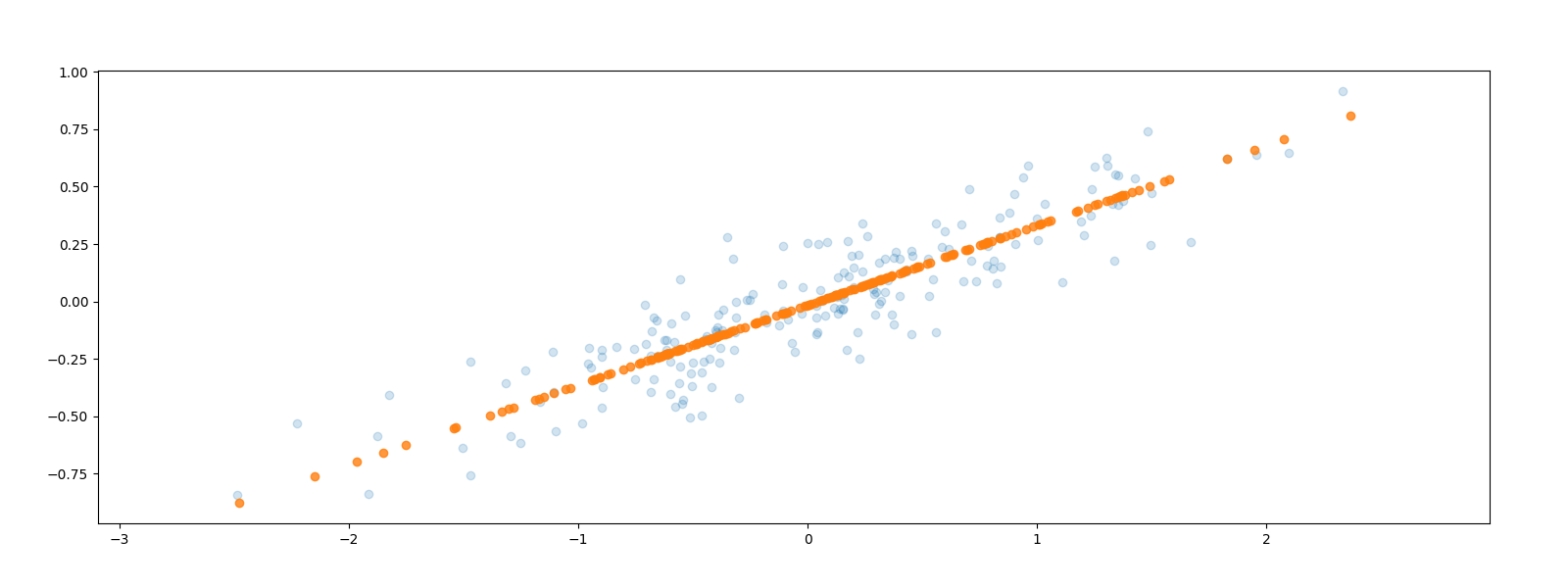
The data points have been projected parallel to the second, smaller axis onto the first, larger axis. Some of the variance in the data has been removed which corresponds to information loss in some sense. The hope is to simplify our problem by reducing the number of dimensions without losing too much information.
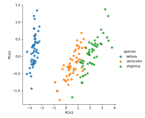
Now, returning to the iris dataset, we can reduce it to two dimensions to cluster it and visualise.
model = PCA(n_components=2)
model.fit(X_iris)
X_2D = model.transform(X_iris)
iris["PCA1"] = X_2D[:, 0]
iris["PCA2"] = X_2D[:, 1]
sns.lmplot(x="PCA1", y="PCA2", hue="species", data=iris, fit_reg=False)
plt.savefig("images/iris2d.png")
PCA for Visualization
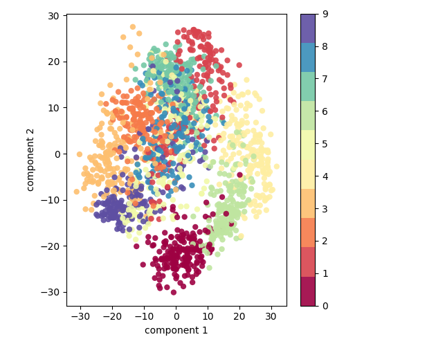
Let's have a look at a data set with a higher number of dimensions, the handwritten digits.
from sklearn.datasets import load_digits

digits = load_digits()
digits.data.shape
(1797, 64)
This version of the data set has 64 pixels per digit, an 8x8 array. Let's project these 64 dimensions onto just 2 so that we can plot the digits on a plane.
pca = PCA(2)
projected = pca.fit_transform(digits.data)
(digits.data.shape, projected.shape)
((1797, 64), (1797, 2))
plt.clf()
plt.scatter(
    projected[:, 0],
    projected[:, 1],
    c=digits.target,
    edgecolor="none",
    alpha=0.9,
    cmap=plt.cm.get_cmap("Spectral", 10),
)
plt.xlabel("component 1")
plt.ylabel("component 2")
plt.colorbar()
plt.savefig("images/digits2d.png")
But what to these two components mean? We could consider an original image to be a linear combination of pixels, so \((x_1, x_2, \ldots, x_{64})\) is something like
\[ image = x_1 \cdot pixel_1 + x_2 \cdot pixel_2 + \ldots + x_{64} \cdot pixel_{64} \]
Each pixel is a component or basis vector which we sum to get the full 64-bit image. For example, the top row of this image of a zero could be decomposed as follows.
![]()
Figure 11: Pixels as basis vectors
But this pixel decomposition is not the only basis we could choose for our vector space. We can also choose the principal components and limit ourselves to, say, eight of them.
\[ image = x_1 \cdot component_1 + x_2 \cdot component_2 + \ldots + x_{64} \cdot component_{64} \]
Each of these components captures some salient feature of "zero-ness". The sum of the coefficients along these components gives us a good approximation of the original image using only 8 dimensions instead of the original 64.
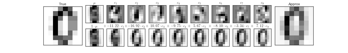
Figure 12: Principal components as basis vectors
But if we can get such a good resemblance with 8 dimensions, how many do we need? What is the optimum number of dimensions for PCA dimensionality reduction?
We calculate the amount of variance each component explains as a fraction of the total variance in the data set and do this cumulatively for the 1,2,3,… principal components.
pca = PCA().fit(digits.data)
plt.clf()
plt.plot(np.cumsum(pca.explained_variance_ratio_))
plt.xlabel("Number of components")
plt.ylabel("Cumulative explained variance ratio")
plt.savefig("images/pca_explained_variance_ratio.png")

The curve has a typical knee shape. We can either select just how much of the variance we want to capture and take the corresponding number of dimensions or just locate the knee of the graph and consider the rest of the dimensions to be diminishing returns. In this case, we might choose about 15 dimensions.
PCA for Noise Filtering
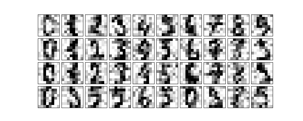
We often find ourselves with noisy data; our images could be blurry. PCA can help us denoise. Any component with an effect smaller than the noise will become swamped by it so we may as well drop it.
Let's first take some digits.
def plot_digits(data):
    plt.clf()
    fig, axes = plt.subplots(
        4,
        10,
        figsize=(10, 4),
        subplot_kw={"xticks": [], "yticks": []},
        gridspec_kw=dict(hspace=0.1, wspace=0.1),
    )
    for i, ax in enumerate(axes.flat):
        ax.imshow(
            data[i].reshape(8, 8),
            cmap="binary",
            interpolation="nearest",
            clim=(0, 16),
        )


plot_digits(digits.data)
plt.savefig("images/some_digits.png")
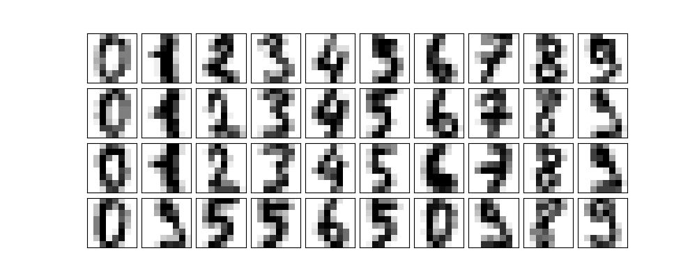
Now let's add some noise to the images.
np.random.seed(42)
noisy = np.random.normal(digits.data, 4)
plot_digits(noisy)
plt.savefig("images/some_noisy_digits.png")
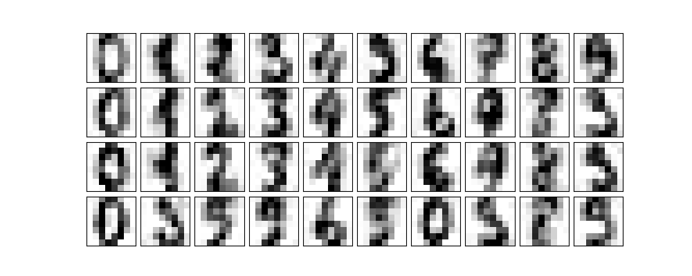
We are now going to ask PCA to fit the noisy digits keeping 50% of the variance.
pca = PCA(0.50).fit(noisy)
pca.n_components_
12
We see that it keeps 12 principal components. How do they look?
components = pca.transform(noisy)
filtered = pca.inverse_transform(components)
plot_digits(filtered)
plt.savefig("images/digits_12.png")
Facial Recognition
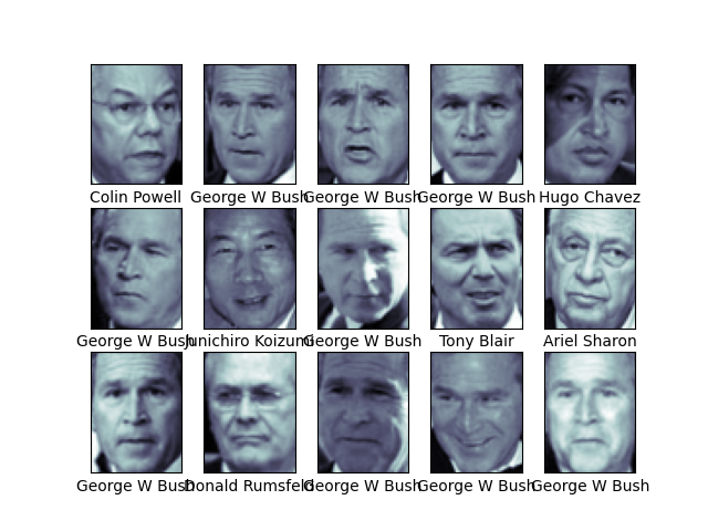
Scikit Learn has a data set of labelled faces. Let's grab some.
from sklearn.datasets import fetch_lfw_people

faces = fetch_lfw_people(min_faces_per_person=60)
(faces.target_names, faces.images.shape)
(array(['Ariel Sharon', 'Colin Powell', 'Donald Rumsfeld', 'George W Bush',
       'Gerhard Schroeder', 'Hugo Chavez', 'Junichiro Koizumi',
       'Tony Blair'], dtype='<U17'), (1348, 62, 47))
We have 1348 images of 8 world leaders. Each image is 62x47=2914 pixels.
Let's have a look at a couple of them.
fig, ax = plt.subplots(3, 5)
for i, axi in enumerate(ax.flat):
    axi.imshow(faces.images[i], cmap="bone")
    axi.set(xticks=[], yticks=[], xlabel=faces.target_names[faces.target[i]])
plt.savefig("images/some_faces.png")
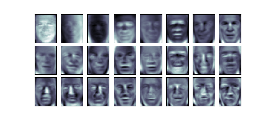
This is quite a large data set so we will apply a randomized, approximate version of PCA which is much quicker than the exact version. We will take the first 150 components of the 2914.
pca = PCA(150, svd_solver="randomized")
pca.fit(faces.data)
PCA(n_components=150, svd_solver='randomized')
The principal components we get correspond to the eigenvectors of the transformation but in this application they are known as eigenfaces. Looking at the first few, it is interesting to see which facial features are most salient in distinguishing the faces.
fig, axes = plt.subplots(
    3,
    8,
    figsize=(9, 4),
    subplot_kw={"xticks": [], "yticks": []},
    gridspec_kw=dict(hspace=0.1, wspace=0.1),
)
for i, ax in enumerate(axes.flat):
    ax.imshow(pca.components_[i].reshape(62, 47), cmap="bone")
plt.savefig("images/eigenfaces.png")
Lab
Work through the section on Regularization in our adapted version of the Lab from the book.
Exercises
- From Section 6.6 carry out Exercise 9. Since we did not do PLS in class, you do not need to do part (f) but you may if you wish.
- Express an image of your own face as the sum of some principal eigenfaces.
Report on your findings, motivating your decisions and citing sources used.
- Take a selfie of your face.
- Download the Labeled Faces in the Wild dataset. (If you wish, you may experiment with other datasets of images of faces such as the Indian Institute of science Indian Face Dataset or DigiFace1M or one of these Free Image Datasets for Facial Recognition)
- Preprocess your selfie and the images in the dataset to a manageable size. For example, you might like to make them all black and white, 64x64 pixel images. You might find the Pillow Python image-processing library useful for this. You might also find it useful to select some of the images from the dataset for use and neglect others.
- Using Principal Component Analysis, find a number of principal components. Decide on the number of components using the proportion of variance explained and a scree plot.
- Express your selfie as the sum of the principal components you selected in the previous step.
etc
- PEP 810: Explicit lazy imports is accepted
- PEP 798: Unpacking in Comprehensions is accepted