Linear Regression
Linear Regression
Advertising data
Here are the first 8 lines of the advertising data set. Each line shows the sales of a product for given advertising budgets on TV, radio and newspapers.
| TV | radio | newspaper | sales |
|---|---|---|---|
| 230.1 | 37.8 | 69.2 | 22.1 |
| 44.5 | 39.3 | 45.1 | 10.4 |
| 17.2 | 45.9 | 69.3 | 9.3 |
| 151.5 | 41.3 | 58.5 | 18.5 |
| 180.8 | 10.8 | 58.4 | 12.9 |
| 8.7 | 48.9 | 75 | 7.2 |
| 57.5 | 32.8 | 23.5 | 11.8 |
| 120.2 | 19.6 | 11.6 | 13.2 |
There are some questions we could ask based on the data.
- Is there a relationship between advertising budget and sales?
- How strong is the relationship between advertising budget and sales?
- Which media are associated with sales?
- How large is the association between each medium and sales?
- How accurately can we predict future sales?
- Is the relationship linear?
- Is there synergy among the advertising media?
Let's read in the advertising data.
from os import getenv
from pathlib import Path

import polars as pl
from dotenv import load_dotenv

load_dotenv(".envrc")

ISLP_DATADIR = Path(
    getenv("ISLP_DATADIR")
    or (
        "/home/bon/projects/auc/courses/ml/website/"
        "islp/data/ALL CSV FILES - 2nd Edition"
    )
)

ads_csv = ISLP_DATADIR / "Advertising.csv"

ads = pl.read_csv(ads_csv)
print(ads.shape)
(200, 5)
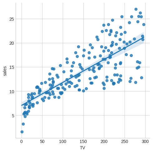
Are sales linear in TV budget? The Seaborn library, built on top of Matplotlib has powerful functionality for plotting regressions. This plot shows not only the regression line but also the confidence level.
import polars_seaborn
import matplotlib.pyplot as plt

plt.style.use("seaborn-v0_8-whitegrid")

ads.sns.lmplot(x="TV", y="sales")
plt.savefig("images/sales-v-TV.png")
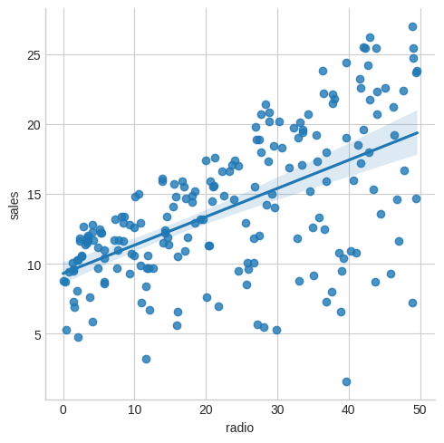
How about radio?
ads.sns.lmplot(x="radio", y="sales")
plt.savefig("images/sales-v-radio.png")
And finally newspaper?
ads.sns.lmplot(x="newspaper", y="sales")
plt.savefig("images/sales-v-newspaper.png")
[<Expr ['col("newspaper")'] at 0x7FB581188D50>, <Expr ['col("sales")'] at 0x7FB581188C50>]
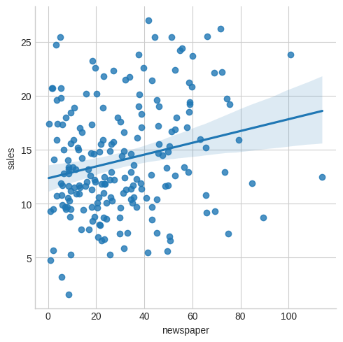
We might conclude that sales are quite linear in TV, a little less so in radio and not very much at all in newspaper.
Linear regression in a single predictor
We assume a model of the form
\[ Y = \beta_0 + \beta_1 X + \epsilon \]
where
- \(Y\) is the response or dependent variable
- \(X\) is the predictor or input variable
- \(\beta_0\) and \(\beta_1\) are two numbers representing the intercept and slope
- \(\epsilon\) is an error term
If we have good estimates \(\hat\beta_0\) and \(\hat\beta_1\) we can predict future sales using
\[ \hat{y} = \hat\beta_0 + \hat\beta_1 x \]
When \(\hat{y_i} = \hat\beta_0 + \hat\beta_1 x_i\) is the prediction for \(Y\) for the ith value of \(X\) then we say \(e_i = y_i - \hat{y_i}\) is the ith residual.
The residual sum of squares (RSS) is
\begin{eqnarray*} RSS &=& e_1^2 + e_2^2 + \dots + e_n^2 \\ &=& (y_1 - \hat\beta_0 - \hat\beta_1 x_1)^2 \\ && + (y_2 - \hat\beta_0 - \hat\beta_1 x_2)^2 \\ && + \dots \\ && + (y_n - \hat\beta_0 - \hat\beta_1 x_n)^2 \end{eqnarray*}We want to choose \(\beta_0\) and \(\beta_1\) to minimize the RSS.
With some calculus we can show the minimizing values are
\begin{eqnarray*} \hat\beta_1 &=& { \sum_{i=1}^n (x_i - \bar{x})(y_i - \bar{y}) \over \sum_{i=1}^n (x_i - \bar{x})^2 } \\ \hat\beta_0 &=& \bar{y} - \hat\beta_1 \bar{x} \\ \end{eqnarray*}where \(\bar{y} = \frac{1}{n} \sum_{i=1}^n y_i\) and \(\bar{x} = \frac{1}{n} \sum_{i=1}^n x_i\) are the sample means.
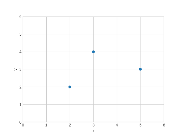
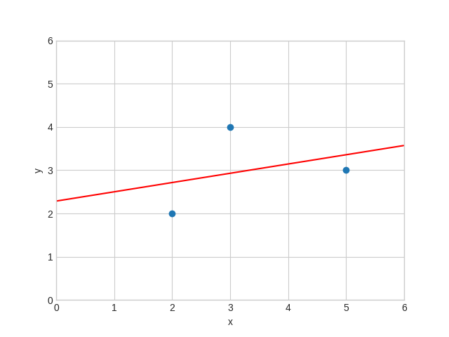
Regression through three points
To get a feel for this let's calculate \(\hat\beta_0\) and \(\hat\beta_1\) with only three data points \((2,2), (3,4), (5,3)\). We first plot the points.
import matplotlib.pyplot as plt

xs = [2, 3, 5]
ys = [2, 4, 3]

fig, ax = plt.subplots()
ax.set(xlabel="x", ylabel="y", xlim=(0, 6), ylim=(0, 6))
ax.scatter(xs, ys)

plt.savefig("images/linreg3points.png")
We could do all the calculations by hand with pen and paper and indeed it would be a good exercise to do so! But we can also use a computer algebra system such as Maxima to do them for us. (Note that we write \(b\) for \(\hat\beta\) in the Maxima code.)
programmode: false;

print(expand((2 - (b0 + 2 * b1))^2));

rss: expand((2 - (b0 + 2 * b1))^2
             + (4 - (b0 + 3 * b1))^2
             + (3 - (b0 + 5 * b1))^2);

d0:  diff(rss, b0);
d1:  diff(rss, b1);

print(rss);
print(d0);
print(d1);

solve([d0 = 0, d1= 0], [b0, b1]);
\[e_1 = 4\,\beta_{1}^2+4\,\beta_{0}\,\beta_{1}-8\,\beta_{1}+\beta_{0}^2-4\,\beta_{0}+4\]
\[RSS = 38\,\beta_{1}^2+20\,\beta_{0}\,\beta_{1}-62\,\beta_{1}+3\,\beta_{0}^2-18\,\beta_{0}+29\]
\[{\partial RSS \over \partial \beta_0} = 20\,\beta_{1}+6\,\beta_{0}-18 = 0\]
\[{\partial RSS \over \partial \beta_1} = 76\,\beta_{1}+20\,\beta_{0}-62 = 0\]
\[\beta_0 = \frac{16}{7}, \beta_1 = \frac{3}{14} \]
Now we use these values to plot the points again, together with the optimal linear regression line.
import matplotlib.pyplot as plt
import numpy as np

X = np.arange(0.0, 6.0, 0.01)
Y = 16 / 7 + 3 / 14 * X

fig, ax = plt.subplots()
ax.set(xlabel="x", ylabel="y", xlim=(0, 6), ylim=(0, 6))
ax.plot(X, Y, color="red")
ax.scatter(xs, ys)

plt.savefig("images/linreg3.png")
Sales v TV
Here is how this all looks for predicting sales from TV.
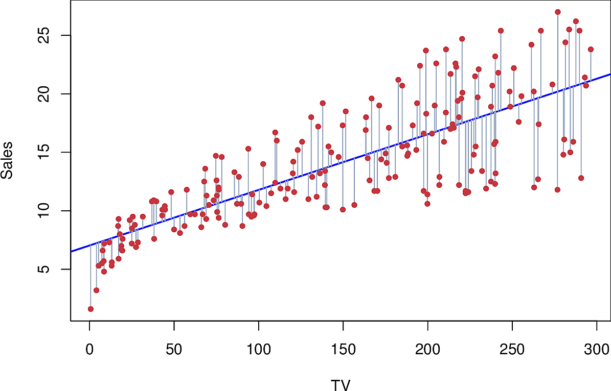
It's a reasonable fit, except on the left.
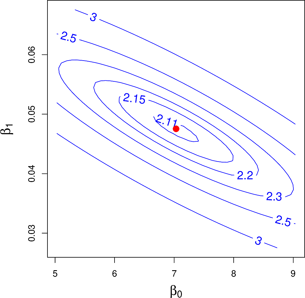
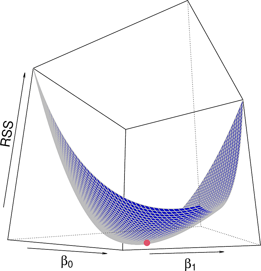
But what would the RSS be for other values of \(\beta_0\) and \(\beta_1\)? We can plot it in two ways: as a contour plot and as a 3-dimensional plot.
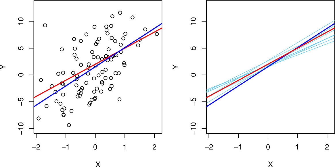
Depending on how we sample our population of data, we will get different regressions but they will not vary much. Here we sample from \(Y = 2 + 3 X + \epsilon\) where \(\epsilon\) is normally distributed. Here, on the left, we see the sample population, the true line (in red) and the regression line (in blue). On the right in light blue we see ten regression lines each generated from a different sample of the data.
We can also calculate confidence intervals and p-values which allow us to carry out a hypothesis test whether there is in fact a linear relationship between the response and the predictor.
A quantity often used is the R-squared or the fraction of variance explained by the linear regression. It is a measure of the overall accuracy of the model. For simple linear regression it is also equal to the correlation between response and predictor. \[ R^2 = 1 - \frac{RSS}{TSS} \] where \(RSS = \sum_{i=1}^n (y_i - \hat{y}_i)^2\) and \(TSS = \sum_{i=1}^n (y_i - \bar{y}_i)^2\)
Even when we get good values for \(R^2\), we should always look at our data. Anscombe's quartet comprises four data sets which have a number of identical statistical properties but are very different.
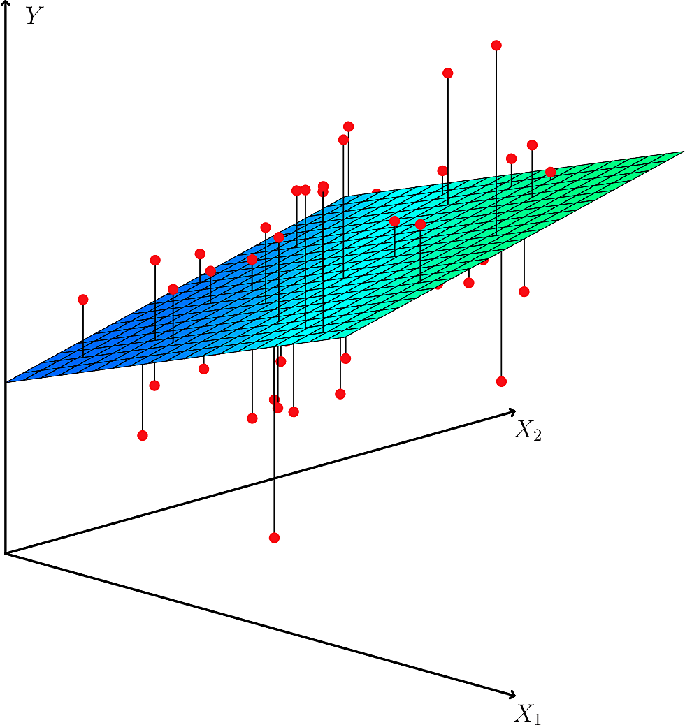
Multiple Linear Regression
We now move to a linear regression that depends on more that one predictor.
\[ Y = \beta_0 + \beta_1 X_1 + \beta_2 X_2 + \dots + \beta_p X_p + \epsilon \]
We interpret each \(\beta_j\) as the average effect on \(Y\) of an increase in \(X_j\) of one unit while holding all other predictor values fixed.
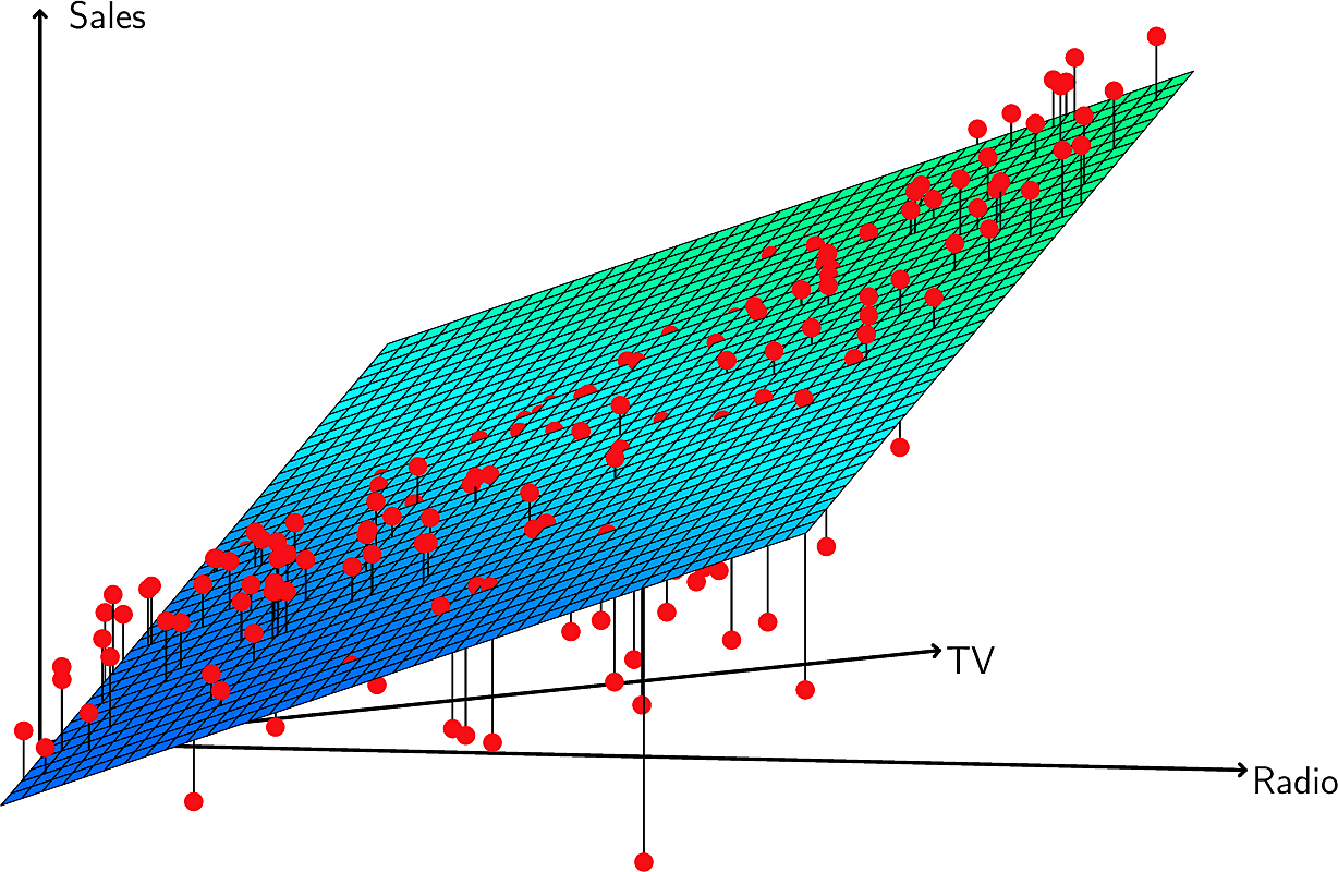
For our advertising data set we have
\[ \mathtt{sales} = \beta_0 + \beta_1 \mathtt{TV}+ \beta_2 \mathtt{radio}+ \beta_3 \mathtt{newspaper} + \epsilon \]
Some caveats:
- When the predictors are uncorrelated, each coefficient can be estimated and tested separately.
- Correlations among predictors cause problems.
- We should not claim causality.
All models are wrong but some models are useful. – George Box
Now we need to estimate \(\hat\beta_0\), \(\hat\beta_1\), \(\hat\beta_2\), …, \(\hat\beta_p\) so that we can predict using
\[ \hat{y} = \hat\beta_0 + \hat\beta_1 x_1 + \hat\beta_2 x_2 + \dots + + \hat\beta_p x_p \]
This works exactly as in the case where we had only one predictor, except that we are now working in \(p+1\) dimensions.
The scikit-learn library provides us with a flexible Linear Regression library. It takes numpy arrays.
import pandas as pd
from sklearn.linear_model import LinearRegression

X = ads[["TV", "radio", "newspaper"]].to_numpy()
y = ads["sales"].to_numpy()

reg = LinearRegression().fit(X, y)

np.set_printoptions(precision=4)

print(
    f"""R^2: {reg.score(X, y):.4f}
Intercept: {reg.intercept_:.4f}
Coefficients: {reg.coef_}
Prediction: {reg.predict([[3, 4, 5]])}"""
)
R^2: 0.8972
Intercept: 2.9389
Coefficients: [ 0.0458  0.1885 -0.001 ]
Prediction: [3.8251]
These are the correlations between the predictors.
print(ads[["TV", "radio", "newspaper", "sales"]].corr())
shape: (4, 4)
┌──────────┬──────────┬───────────┬──────────┐
│ TV       ┆ radio    ┆ newspaper ┆ sales    │
│ ---      ┆ ---      ┆ ---       ┆ ---      │
│ f64      ┆ f64      ┆ f64       ┆ f64      │
╞══════════╪══════════╪═══════════╪══════════╡
│ 1.0      ┆ 0.054809 ┆ 0.056648  ┆ 0.782224 │
│ 0.054809 ┆ 1.0      ┆ 0.354104  ┆ 0.576223 │
│ 0.056648 ┆ 0.354104 ┆ 1.0       ┆ 0.228299 │
│ 0.782224 ┆ 0.576223 ┆ 0.228299  ┆ 1.0      │
└──────────┴──────────┴───────────┴──────────┘
Here are full statistical results for the advertising data as given by the statsmodels library.
import statsmodels.api as sm

estimate = sm.OLS(y, sm.add_constant(X)).fit()

print(estimate.summary())
                            OLS Regression Results
==============================================================================
Dep. Variable:                      y   R-squared:                       0.897
Model:                            OLS   Adj. R-squared:                  0.896
Method:                 Least Squares   F-statistic:                     570.3
Date:                Thu, 25 Sep 2025   Prob (F-statistic):           1.58e-96
Time:                        07:57:13   Log-Likelihood:                -386.18
No. Observations:                 200   AIC:                             780.4
Df Residuals:                     196   BIC:                             793.6
Df Model:                           3
Covariance Type:            nonrobust
==============================================================================
                 coef    std err          t      P>|t|      [0.025      0.975]
------------------------------------------------------------------------------
const          2.9389      0.312      9.422      0.000       2.324       3.554
x1             0.0458      0.001     32.809      0.000       0.043       0.049
x2             0.1885      0.009     21.893      0.000       0.172       0.206
x3            -0.0010      0.006     -0.177      0.860      -0.013       0.011
==============================================================================
Omnibus:                       60.414   Durbin-Watson:                   2.084
Prob(Omnibus):                  0.000   Jarque-Bera (JB):              151.241
Skew:                          -1.327   Prob(JB):                     1.44e-33
Kurtosis:                       6.332   Cond. No.                         454.
==============================================================================

Notes:
[1] Standard Errors assume that the covariance matrix of the errors is correctly specified.
Note:
- The standard errors are low except for the intercept
- The t-statistics are high except for
newspaper - The p-values are low except for
newspaper
Deciding on Important Predictors
We ask ourselves, do all the predictors help to explain \(Y\), or is only a subset of the predictors useful?
We could take each subset of the predictors to see which subset gives the lowest error. When we have \(p=3\) predictors there are \(2^3 = 8\) subsets so that is manageable but if we have \(p=40\) predictors then there are \(2^{40}\) subsets, over a trillion! So we need a more systematic way of exploring the subsets. Some options are as follows.
- Forward selection
- begins with no predictors, only an intercept. Fit \(p\) models, one for each predictor and keep the one which results in the lowest RSS. Not fit each of the \(p-1\) models got by adding each remaining parameter to the best from the first round. Continue this process until some pre-agreed criterion is satisfied; for example, the last added predictor added too little to the explained variance.
- Backward selection
- Remove the parameter which is least statistically significant, i.e. the one with the largest p-value. Fit the \((p-1)\)-parameter model and repeat this process until some pre-agreed criterion is satisfied, e.g. when all remaining parameters have small enough p-values.
- Information theoretic criteria
- such as Akaike or Bayesian. More about these later.
Categorical variables
Here are the first 8 lines of the Credit Card data set.
| Income | Limit | Rating | Cards | Age | Education | Own | Student | Married | Region | Balance |
|---|---|---|---|---|---|---|---|---|---|---|
| 14.891 | 3606 | 283 | 2 | 34 | 11 | No | No | Yes | South | 333 |
| 106.025 | 6645 | 483 | 3 | 82 | 15 | Yes | Yes | Yes | West | 903 |
| 104.593 | 7075 | 514 | 4 | 71 | 11 | No | No | No | West | 580 |
| 148.924 | 9504 | 681 | 3 | 36 | 11 | Yes | No | No | West | 964 |
| 55.882 | 4897 | 357 | 2 | 68 | 16 | No | No | Yes | South | 331 |
| 80.18 | 8047 | 569 | 4 | 77 | 10 | No | No | No | South | 1151 |
| 20.996 | 3388 | 259 | 2 | 37 | 12 | Yes | No | No | East | 203 |
| 71.408 | 7114 | 512 | 2 | 87 | 9 | No | No | No | West | 872 |
Note that several of the variables are not numeric.
- Own
- is the credit card holder a home owner, yes or no.
- Student
- is the card holder a student, yes or no.
- Married
- is the card holder married, yes or no.
- Region
- which region of the country does the card holder live; North, South, East or West.
We call such variables categorical. Since our Linear Regression approach can only deal with numbers, how can we make use of such categorical variables?
Two approaches are common.
- Dummy variable
- For a two-valued variable such as
Ownwe replace each occurrence ofYesby \(1\) and ofNoby \(0\). We can extend this to variables which take more values by mapping{North: 0, South: 1, East: 2, West: 3}but this can be problematic. Do we really want the "distance" betweenNorthandWestto be bigger than the "distance" betweenNorthandSouthfor the purposes at hand? - One-hot encoding
Let us consider the variable
Regionwhich takes 4 values. We replace this variable by 4 variables, one for each of the values. In each line of data exactly one of these variables takes the value \(1\), the one corresponding to the value in theRegioncolumn. The other three take the value \(0\). So for example, a line withRegiontaking the valueSouthwould get 4 new values.North South East West 0 1 0 0
This avoids the "distance" problem of dummy variables but it may in some cases increase the number of variables significantly. As we will see later in the course, the computational complexity of machine learning models can often increase drastically in the number of variables, which we call the dimensionality of the problem.
Interactions and Synergies
Let's leave aside \(\mathtt{newspaper}\) and consider an advertising model of the form:
\[ \mathtt{sales} = \beta_0 + \beta_1 \mathtt{TV}+ \beta_2 \mathtt{radio} + \epsilon \]
Note how increasing the advertising spend on TV increases the sales by \(\beta_1\) independently of the spend on radio. But what if there is an interaction between TV and radio spending? If we look closely at this plot, we see that our the data points are above our linear model in some regions and under it in others. In particular when the spend on TV and radio is similar there are many points above the place while when there is a larger difference in spend they are below it. This suggests an interaction or synergy between TV and radio.
We might add an interaction term to our model. \[ \mathtt{sales} = \beta_0 + \beta_1 \mathtt{TV}+ \beta_2 \mathtt{radio} + \beta_3 \mathtt{TV} \; \mathtt{radio} + \epsilon \]
Note that this is still a linear regression model. It is no longer linear in the predictors \(\mathtt{TV}\) and \(\mathtt{radio}\) but it remains linear in its parameters \(\beta_0\), \(\beta_1\), \(\beta_2\), and \(\beta_3\) so we can continue to apply the same technique.
If we fit the model which contains the \(\mathtt{TV} \; \mathtt{radio}\) term we find \(R^2 = 0.968\) as opposed to \(0.897\) for the model without the interaction term.
In fact the interaction term has a lower p-value than those of the individual additive terms. However this should not tempt us to leave out the individual terms. We call this the hierarchical principle.
We can include other interaction terms as we see fit but note that the number of such possible terms becomes combinatorially large.
We might also consider a non-linear relationship with a single predictor, such as \(\mathtt{TV^2}\). Here is an example from the Auto data set where we are predicting miles per gallon from horsepower of the engine of the car. We suspect there may be a power relationship between \(\mathtt{mpg}\) and \(\mathtt{horsepower}\) and try fitting \(\mathtt{horsepower}\), \(\mathtt{horsepower^2}\) and \(\mathtt{horsepower^5}\)
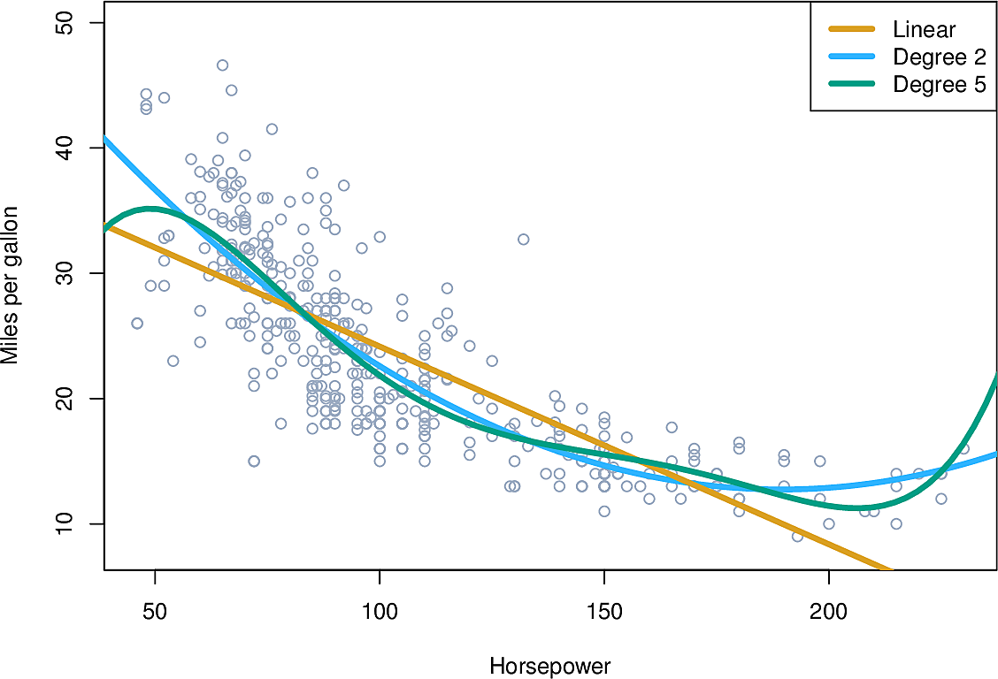
Again, the regression remains linear despite the non-linear dependency on horsepower.
But note how the green line "wiggles" more than we might like; it's not smooth enough. Also note how it behaves on the left and right edges of the graph; it appears to be moving away from the data points so we expect it would extrapolate badly. We will return to this question of overfitting data later in the course.
Potential problems and how to address them
- Non-linearity of the data
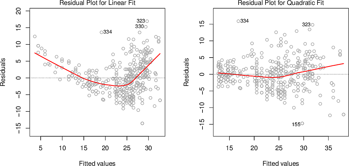
If the data are highly non-linear then we must treat any conclusions we draw from Linear Regression with suspicion. A residual plot can help us identifying such non-linearity. These graphs show the residuals for \(\mathtt{mpg}\) against \(\mathtt{horsepower}\) on the left and for \(\mathtt{mpg}\) against \(\mathtt{horsepower}\) and \(\mathtt{horsepower^2}\) on the right. On the left there is a clear pattern to the residuals, while on the right it is considerably less.
- Correlation of error terms
Our estimates for confidence intervals are based on the assumption that the errors on the columns of our data are independent of each other. If they are not then we might be too optimistic about our results.
For example, suppose we read in our dataset twice, instead of just once (This happens!). Now we have \(2n\) data points instead of \(n\) and since the width of our confidence intervals are proportional to \(\frac{1}{\sqrt{n}}\) they will now be smaller by a factor of \(\sqrt{2}\).
Correlation among error terms often occur in Time Series data so we will return to this question.
- Non-constant variance of error terms
Heteroscedasticity occurs when the variance differs for different values. Another assumption of estimates is that the variance is homoscedastic, i.e. that the variance is relatively constant across all values.
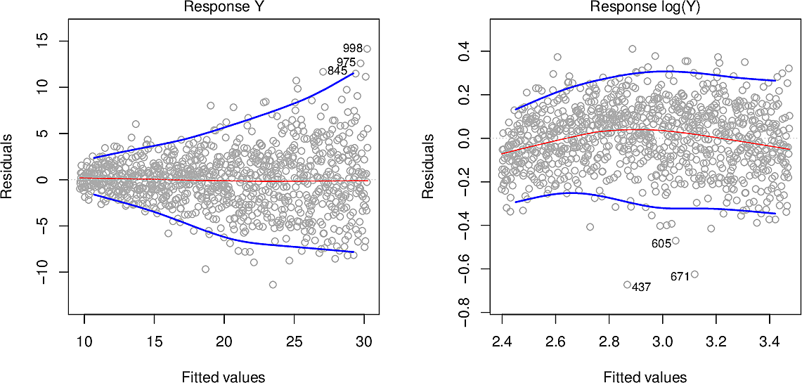
In these residual plots we can see in the plot on the left how the variance increases from left to right. One way to mitigate this is to take not \(Y\) as the response but \(\log Y\) or \(\sqrt{Y}\). The plot on the right has been log-transformed, leaving us with relatively constant variance.
- Outliers
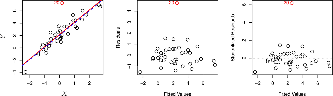
An outlier is a value that stands out as being far from the trend. An outlier often arises as a recording error or a typo. Outliers can be removed but should be done so in a considered way and their removal should be recorded among the assumptions you make when modelling. There are formal techniques for identifying outliers such as studentized residuals but more often than not we identify them by eye.
The plot below shows an outlier in red as observation 20. The red line is the linear regression line including it, while the blue one is the regression line after removing it. In this case removal has little effect.
- High-leverage points
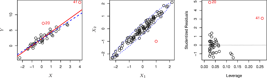
High-leverage points are similar to outliers but whereas an outlier might have little effect on our outcome, a high-leverage point can have considerable influence.
In the plot below we can see that observation 41, because it falls far outside the range of the other points, exerts an undue "pull" on the regression line. Removing it has a more significant effect than the removal of observation 20.
- Collinearity
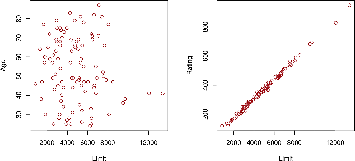
Collinearity arises when two predictor variables are closely related to each other. In the plot below we can see a close relationship between \(\mathtt{Limit}\) and \(\mathtt{Rating}\), whereas there is no discernible relationship between \(\mathtt{Limit}\) and \(\mathtt{Age}\). Such relationships should be examined and removed.
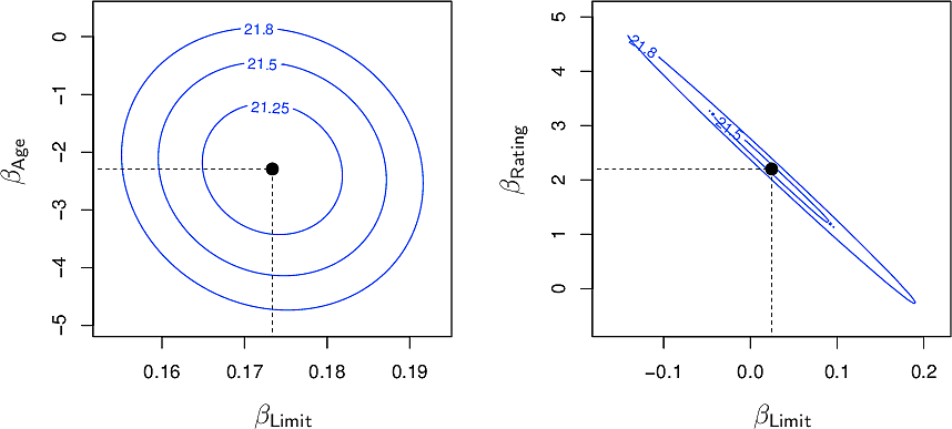
From the contour plots for the RSS values of the above predictors we can see on the left that the minimum is well defined whereas on the right, many pairs have similar values around the minimum.
Non-parametric methods
Linear regression is a parametric approach. The \(\beta\) are the parameters.
Parametric methods are
- easy to fit
- easy to interpret
- easy to test for statistical significance
However they also make strong assumptions about the functional form of \(f\) which may be far from the true relationship.
Non-parametric methods do not make such assumptions and can be more flexible in practice. An example of a non-parametric method we will explore in more detail later is \(K\)-Nearest Neighbours (KNN) regression. We choose a whole-number value for \(K\), say 3. Now to make a prediction for a point \(x_0\) we find the 3 points in our training set which are closest to \(x_0\). We call this set of points the neighbourhood of \(x_0\), written \(\mathcal{N_0}\). We let \(\hat{f}(x_0)\) be the average of the responses corresponding to \(\mathcal{N_0}\).
\[ \hat{f}(x_0) = {1 \over K} \sum_{x_i \in \mathcal{N_0}} y_i \]
The choice of value for \(K\) is a trade-off. Smaller values give a "blocky" function while larger values give a smoother function which can be "over-smoothed". We will study this bias-variance trade-off in more detail later in the course.
So which to choose, a parametric or non-parametric method? Quoting ISLP,
The answer is simple: the parametric approach will outperform the non-parametric approach if the parametric form that has been selected is close to the true form of \(f\).
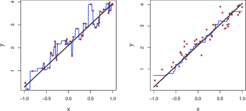
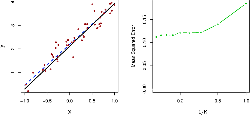
Let's look at KNN on some almost-linear data.
The black line is the true relationship. The red dots are samples from the true relationship by adding some noise. The blue line is the KNN regression with \(K=1\) on the left and \(K=9\) on the right.
Here are the same data with the least-squares linear regression line in dashed blue. On the right we see the mean squared error for the linear regression in dashed black and for KNN in green for various values of \(K\). Note that the plot is in terms of the inverse \(1/K\).
Because the parametric form we chose is close to the true form of our data, the parametric approach beats the non-parametric approach for all values of \(K\).
Now let's consider data which are not so linear and data that are very non-linear. We see that the non-parametric method begins to shine and indeed outdo the parametric method.
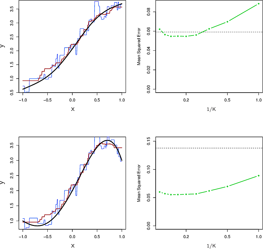
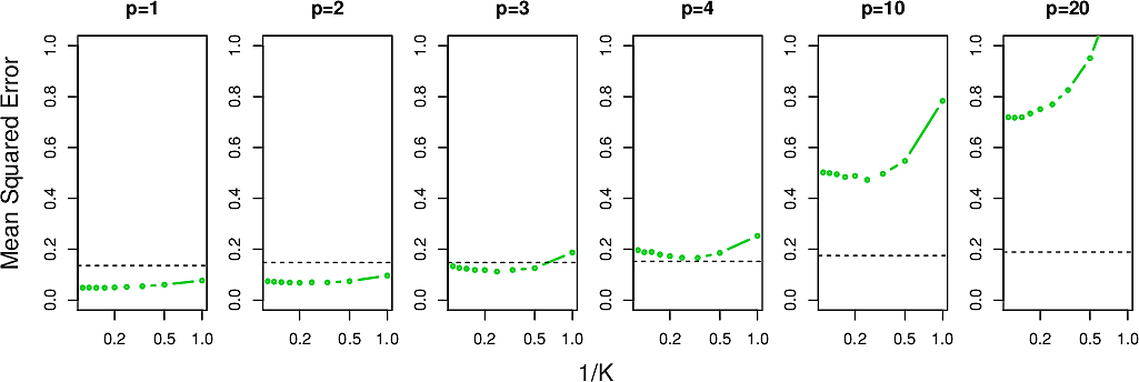
Summing up, we might conclude that KNN is more flexible that linear regression but strange things happen in higher numbers of dimensions. In particular, our notions of distance that we are familiar with in three dimensions or less will begin to let us down. We call this the Curse of Dimensionality and will revisit it later in the course. For now we look at how the MSE behaves for the above example in higher numbers of dimensions \(p\).
This week's assignment
- Follow the lab in section 3.6 of the ISLP book and adapt it to use Polars
- Make a new repo and carry out Exercises 8 and 9 of Section 3.7 of the ISLP book
using Polars.
The teams are…
[
    ("Jess", "Matúš"),
    ("Efraim", "Romane"),
    ("Madalina", "Fridolin"),
    ("Yaohong", "Natalia", "Emilio"),
    ("Emil", "Adrian"),
    ("Janina", "Mariana"),
    ("Nora", "Asmahene"),
    ("Roman", "Lynn"),
    ("Carlijn", "Giorgia"),
]
etc
- The slides from the guest lectures are available
- One in five genetics papers contains errors thanks to Microsoft Excel